 StartHub
Chrome finally lets you search your bookmarks: why it's late and how to organize your links in the meantime
Team at StartHubWritten with AI assistance13 min readIn summary
- On November 7, 2026, it was discovered in Chrome Canary that the search box in the new three-dot menu is now functional: typing returns browser actions, bookmarks, and recent history, grouped by type (PiunikaWeb, 11/07/2026).
- No date for the stable version: it remains an experiment in Canary, the daily testing channel of Chrome.
- The search only helps if you remember the name of the site. It does not fix the cluttered favorites bar, nor the seven-level folders, nor does it let you see all your links at once.
- There are four real ways to organize your links today: clean folders, reserve the favorites bar for daily use, use tab groups for live projects, and replace the blank page with a visual homepage.
- In the end, you have a 20-minute checklist to make your bookmarks usable in one sitting.
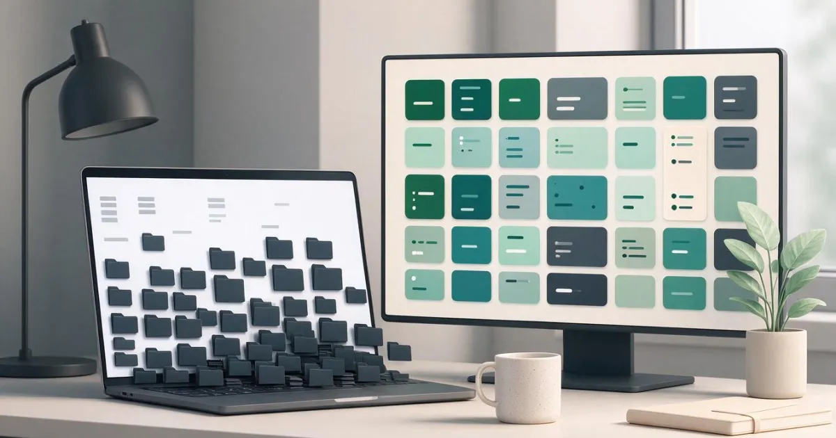
If you have several hundred saved bookmarks and the fastest way to return to a website is to type its name into Google, you are not an unusual case: it is the normal behavior of anyone working with dozens of tools in the browser. The novelty this month is that Chrome has finally started to fix it internally, although only halfway. In this article, we review what really changes, why browser bookmarks degrade on their own, and what you can do today, including setting up your own link panel with StartHub, the mini app from AIsToHire that turns your favorites into an organized bookmark panel by categories.
What has been discovered: Chrome's three-dot menu now searches your bookmarks
On November 7, 2026, PiunikaWeb published that the search box in the redesigned three-dot menu is now returning results in Chrome Canary: you type a few letters and browser actions, saved bookmarks, and sites from recent history appear. Until now, that search field existed in the redesign but did nothing when typing. The discovery is from the leaker Leopeva64, who documented it with screenshots.
According to Digital Trends' coverage on November 4, 2026, the results appear separated by type: browser commands, bookmarks, and history in distinct blocks, so that a setting is not confused with a saved link. The redesign of the menu also includes larger buttons for new tab and window, a standard scrollbar instead of the arrows that appeared when hovering, and the search field and the bottom of the menu fixed while the rest scrolls.
| Data | Status as of 12/11/2026 |
|---|---|
| Channel where it is | Chrome Canary (daily test builds) |
| What it finds | Browser commands, bookmarks, and recent history |
| How they are presented | Grouped by type, in separate sections |
| Other menu changes | Blocks, standard scrollbar, fixed search and footer |
| Date for stable version | Not announced |
| Who uncovered it | Leopeva64, on X |
On Android, the movement is parallel: Chrome is testing dedicated panels for bookmarks and history (the Bookmark Hub Pane and History pane Android flags), instead of burying them in the settings menu, and a bookmarks bar on tablets and foldables similar to the desktop. The pattern is clear: Google has acknowledged that access to what you save was poorly resolved.
That this matters to so many people is no coincidence. According to Statcounter, in October 2026 Chrome had a 68.79% global browser market share, compared to 16.59% for Safari and 5.36% for Edge. When Chrome changes how bookmarks are searched, it changes the habits of two out of three internet users.
What the menu search fixes and what it doesn't
The search function solves one problem: finding a specific bookmark when you remember what it's called. It does not solve any of the other three, which are the ones that truly degrade your browser: the saturated favorites bar, the nested folders without criteria, and the inability to see everything you have saved at a glance.
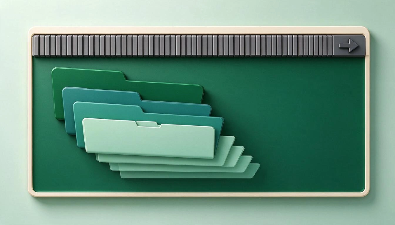
The difference is the one between searching and browsing. Searching requires that you already know what you want and what it's called. Browsing is looking and recognizing. When you saved "Control Panel" eight months ago and today you don't remember if it was from the analytics tool, the ad manager, or the hosting, no text-based search will save you: you don't know what to type.
| Real Problem | Does the menu search fix it? | Why |
|---|---|---|
| I can't find a bookmark whose name I remember | Yes | It's exactly for this |
| I don't remember what the site was called | No | The search is text-based, not visual recognition |
| The favorites bar is saturated and unreadable | No | The menu doesn't touch the bar |
| I have seven levels of nested folders without criteria | No | Search avoids hierarchy, it doesn't organize it |
| I want to see all my links from a project together | No | It returns loose results, not views by category |
| I have duplicates and broken links from years ago | No | They will also appear in the results |
In other words: the search makes a disorganized archive tolerable, but it doesn't organize it. And until it reaches the stable version —without a date— not even that.
Why browser bookmarks degrade on their own
Because the cost of saving is almost zero and the cost of maintaining is high. You press Ctrl+D (or Cmd+D), accept the title proposed by the page, it goes to "Other bookmarks" and you never look at it again. The system is designed to capture, not to preserve.
There are four design flaws that accumulate over the years:
- It saves in one click and is never reviewed. There is no moment in the flow that invites you to review what you've saved, so it doesn't happen.
- The title is set by the website, not you. You end up with dozens of entries called "Home", "Dashboard", "Panel", or "Documentation", all different and all indistinguishable.
- There is no real category, only folders. A folder forces you to choose a single place for each link. If a tool serves two projects, you lose.
- There is no "all together" view. The bookmark manager shows text lists, one folder at a time. You never see your complete work environment.
On top of that, there is the context: according to the study by Harvard Business Review on the cost of toggling between applications (August 2022), which measured 137 employees from three Fortune 500 companies, a digital worker toggles about 1,200 times a day between applications and websites, and loses just under four hours a week just in reorienting themselves after each jump: around 9% of their workday. Every second you spend hunting for a link multiplies by that number.
The four real ways to organize your links today
There are four approaches that work without waiting for any version of Chrome, and they are not mutually exclusive: it makes sense to combine them. The table summarizes when each one makes sense.
| Way | What it's for | Pros | Cons |
|---|---|---|---|
| Clean and rename folders | Reduce the historical file to what you actually use | Free, no tools; improves any subsequent search | Manual and boring work; it degrades again if you don't repeat |
| Favorites bar just for daily use | One-click access to 8-12 sites | Super fast; always visible | Limited space; it gets cluttered in weeks if you don't hold back |
| Tab groups | Live projects, lasting days or weeks | They are saved and synced with your account | Does not replace the archive: they are work sessions, not a catalog |
| Visual homepage | See everything in your work environment at a glance | Visual recognition, categories, multiple pages | Needs to be set up once |

Way 1: clean and rename folders
Open the bookmark manager and apply a strict rule: if you haven't opened it in a year and you couldn't explain what it's for, delete it. Then rename: "Dashboard" doesn't work, "Blog Analytics" does. A good name is one you would write if you had to search for it in six months, and that's exactly what will make the future Chrome search useful when it reaches the stable version.
Limit the depth to two levels. If you need a third, what you have is not a folder: it's a new category.
Way 2: the favorites bar, just for daily use
The favorites bar has room for a few links before it becomes unreadable. Treat it like a physical desk: only what you use today. A trick that saves immediate space is to delete the text from the bookmark and leave only the favicon, allowing three times as many sites to fit, and you recognize them just by the icon.
Everything else — what you use once a week or once a month — should not be there. That is the material that calls for one of the other two ways.
Way 3: tab groups for live projects
Chrome's tab groups are for ongoing work: an opposition, a client, a delivery. You group the tabs, name them, give them color, and collapse them when not in use. The important thing is that they are saved and synced: according to the official Chrome help on managing tabs, when history and tabs are synced with your Google account, changes in tab groups are saved and synced across all your devices.
Its limit is conceptual: a tab group is a work session, not a catalog. It serves for the ten links of this week, not for the two hundred tools you use throughout the year.
Way 4: replace the blank page with a visual homepage
This is the way that addresses the problem that none of the others solve: seeing everything together. Every time you open a new tab, you have an underutilized space in front of you. If that site has a panel with your links grouped by category and with the icon of each site, you stop searching and start recognizing, which is much faster and doesn't depend on your memory.
Here fits StartHub, the mini app from AIsToHire: a personal bookmark panel where you organize your links in blocks by category with names you choose and reorder by dragging and dropping. Each block can be viewed as a list or as a grid of icons, and when you paste a URL, it automatically imports the site's favicon and suggests its title, so setting up a block takes minutes. You can spread the blocks across multiple pages — Work, Study, Personal — each with its columns and background. And it brings the two searches missing in the browser: an internal search of your own links and a web search with engine selector (Google, Bing, DuckDuckGo, or YouTube), all on the same screen.
It is, point by point, what the search in the Chrome menu does not provide: the complete view, the category, and visual recognition.
20-minute checklist to organize your bookmarks
Twenty well-spent minutes are worth more than any feature that arrives in 2027. This is the order that works best, from what gives the most relief to what takes the most time.

- Minutes 0-3 · Empty the favorites bar. Leave only what you have opened this week. The rest goes into a folder called "To sort".
- Minutes 3-7 · Delete ruthlessly. In the bookmark manager, remove what you haven't opened in a year. If in doubt, delete: if you need it, you can find it again.
- Minutes 7-11 · Rename the survivors. No more "Home" or "Panel". Name of the tool plus what you use it for.
- Minutes 11-14 · Flatten the hierarchy. Maximum two levels of folders. What doesn't fit in two levels needs its own category.
- Minutes 14-17 · Group the live ones. What you are using this week, to a tab group with name and color.
- Minutes 17-20 · Set up your homepage. Create four or five blocks by category (Work, Communication, Documentation, Finance, Leisure) and paste in the links that have survived. When you paste the URL, the favicon and title come in automatically.
Repeat step 2 once every quarter and the archive will not degrade again.
Frequently Asked Questions
When will the bookmarks search feature arrive in stable Chrome?
No date has been announced. As of November 12, 2026, the feature is only in Chrome Canary, the daily testing build channel, and Google has not communicated which stable version it will appear in or if it will at all. Canary features can change or be withdrawn before reaching the public.
How do I search among my bookmarks in Chrome right now?
From the bookmarks manager: open chrome://bookmarks and use its search field. You can also type in the address bar and Chrome will suggest bookmarks and history among the suggestions. What is new —and still experimental— is that this search is also within the three-dot menu with results grouped by type.
Why do I never find the bookmarks I save?
Because you saved the title that the website provided, not a description of your own, and you put it in a folder that you no longer remember. The problem is usually not the quantity, but that the names mean nothing and there is no view that allows you to see everything together and recognize what you are looking for.
Is it better to use bookmark folders or tab groups?
They are different things. Tab groups are for ongoing work —they are saved and synced across devices with your Google account, according to the Chrome help— and folders serve as long-term archives. For day-to-day use, what works best is a third layer: a homepage where everything you use is grouped by category.
What is a personal homepage and how does it differ from bookmarks?
It is a personal page that replaces the empty new tab and visually displays your links grouped in blocks, with the icon of each site. The difference with bookmarks is that you see everything at once instead of opening lists one by one, and that the same work environment can be spread across several pages by context.
Do I need to install any extension to have a bookmarks panel?
Not necessarily. StartHub works in the browser, without an extension, so your link blocks are available on any computer where you log in. This also avoids the classic problem of bookmark extensions: that they stop being maintained and you lose access to what you saved.
Can bookmarks be organized on mobile?
Getting better all the time. Chrome is testing dedicated panels for bookmarks and history on Android and a bookmarks bar on tablets and foldables, according to MSPoweruser. Still, organizing by categories remains easier to set up on desktop and then consult from mobile.
Conclusion: searching is good, recognizing is better
That Chrome incorporates a bookmarks search in the menu is good news that comes years late and, for now, without a date for the stable version. But even when it arrives, it will still be a tool for those who already know what they are looking for. The underlying problem —hundreds of links without categories, without useful names, and without any overview— is not solved with a text field, but by dedicating twenty minutes to throw away what is unnecessary and placing what remains where you can see it.
That last part is what StartHub solves, the mini app from AIsToHire: blocks by category with automatic favicon, list or grid view, multiple pages, and its own search plus web search. If you want to start there, set up your homepage with your organized bookmarks and stop typing in Google the names of websites you already had saved.
Set up your homepage with your organized links, for free
Set up your homepage with your organized links, for freeKeep reading
View all articles →
How to Organize Browser Bookmarks When You Already Have Hundreds: A 7-Step Method

Why Your Car Insurance Increased in 2026: Average Premium of €1,412 and Historic Record

Discussing via WhatsApp or talking in person: what science says about couple conflicts through messages