 FlowBoard
Mermaid slop: how to review and correct the diagrams generated by AI before publishing them
Team at FlowBoardWritten with AI assistance15 min readIn summary:
- "Mermaid slop" is the name that became popular in 2026 for AI-generated diagrams that are valid in syntax but unreadable or outright false; the term originated from the Diagram Design project, which was presented with the slogan "no Figma, no generic rounded boxes, no Mermaid-slop" and had already surpassed 11,000 stars on GitHub by August 2026 (explainX, 16-08-2026).
- The problem grew with distribution: VS Code 1.121 (20-05-2026) renders Mermaid natively in the Markdown preview, without extension, and the assistants generate it by default (Visual Studio Code).
- A model optimizes grammatical validity, not system correctness: the
.mmdparses, but duplicates nodes, leaves the "no" branch of a decision, or reverses the direction of the data. - Reviewing a diagram by reading lines of
-->does not work: the defects that matter are topological and can only be seen when drawn. - The cycle that does work: import the
.mmdto a canvas, reorder by layers, annotate the doubtful with a link to the code or ticket that proves it, correct by hand, and re-export so that the corrected version is the one that enters the repository.
Since mid-2026, the question in engineering teams is no longer how to generate a diagram, but who is responsible for it. Agents write Mermaid on the fly, GitHub and VS Code display it without configuration, and the result enters the README with the same naturalness as a code block. What is missing is the audit layer. This article covers the typical defects, the technical reason they appear, and a reproducible review cycle that closes on a visual canvas —in our case, FlowBoard, the infinite whiteboard for diagrams from AIsToHire, which imports and re-exports Mermaid— so that the published diagram is the corrected one and not the first one spat out by the model.

What exactly is "Mermaid slop"?
Mermaid slop is an AI-generated diagram that compiles without errors and yet is useless: identical rounded boxes for different concepts, arrows without labels or with vague labels, default colors that say nothing, and a reflexive generation —it is drawn because it was requested, not because it is needed—. The definition is set by the review of explainX on the term (16-08-2026), which traces it back to Cathryn Lavery's Diagram Design project.
The important nuance is that there are two layers of "slop" and they are often confused:
| Layer | What fails | Detected | Cost to fix |
|---|---|---|---|
| Aesthetic | Generic shapes, default palette, everything the same | At first glance | Low: theme, shapes, grouping |
| Semantic | The diagram describes a system that does not exist | Only by comparing with the actual code | High: the repository must be reopened |
The public conversation of 2026 has focused almost entirely on the first. The tools that have emerged —from editorial diagramming skills to generators that produce native Excalidraw elements instead of Mermaid text— primarily address this aspect. The second layer, the one that makes a diagram lie about your architecture, remains human work.
Why does an LLM produce perfect Mermaid syntax but poor semantics?
Because they are two distinct objectives and only one has abundant training signal. The grammar of Mermaid is closed, small, and massively represented on GitHub: a model reproduces it almost flawlessly. The correction of the diagram, on the other hand, depends on a specific system that the model typically has not read in full, so it fills in the gaps with the most common form of an architecture diagram, not yours.
In addition, three practical effects come into play:
- The prompt is the only source. If you describe the system in three sentences, the agent returns a diagram with the granularity of three sentences and decorates it until it looks complete. As Mermaid itself summarizes when talking about vibe diagramming, "a diagram generated from a vague prompt will reflect the vagueness of the prompt" (Mermaid, 24-03-2026).
- There is no semantic compiler. A red test warns you; an incorrect diagram renders just as beautifully as a correct one. There is no equivalent to
tscfor "this service does not exist". - The layout is decided by the engine, not the author. Mermaid places the nodes with its algorithm and does not offer a convenient way to correct the layout after rendering. If the actual hierarchy does not match what the auto-layout draws, you lose the argument with the tool.
And the context of the sector says that verification is not optional. The 2026 Stack Overflow developer survey (published on 06-10-2026, over 30,000 responses in 169 countries) found that nearly half trust AI output only when they can easily verify it, and that only 6.6% would consider it good for important decisions. An architecture diagram in official documentation is, almost by definition, an important decision.
The seven recurring defects of an AI-generated diagram
These are the seven that appear over and over again when auditing .mmd generated by agents. All parse; all are wrong. The common pattern is that the model fills in plausible structure where it lacks domain information.

| # | Defect | Symptom in the .mmd | Consequence |
|---|---|---|---|
| 1 | Duplicate nodes | Two distinct IDs with similar labels for the same service | It seems there are two components where there is one |
| 2 | Decision without "no" branch | A diamond with a single outgoing edge | The error path remains undocumented |
| 3 | Flow without terminator | Chains that end in a process node | It is unclear when the use case ends |
| 4 | Inverted direction | The arrow points to the data source | It reverses who calls whom |
| 5 | Generic box | A single node "Database" | Hides three stores with different guarantees |
| 6 | False depth | Layers or subgraph that do not exist in the code | Gives authority to an invented architecture |
| 7 | Prompt labels | The nodes repeat your words, not the domain vocabulary | The diagram is neither searchable nor recognizable |
1. Duplicate nodes that are the same service
The model has seen "auth" and "authentication service" in two different sentences and has created two nodes.
flowchart LR
  API[API Gateway] --> AUTH[Auth]
  API --> AUTHSVC[Authentication service]
  AUTH --> DB[(Database)]
  AUTHSVC --> DB
Corrected: one node, one ID, the name used by the team.
flowchart LR
  API[API Gateway] --> AUTH[auth-service]
  AUTH --> USERS[(postgres: users)]
2. Decisions without "no" branch
flowchart TD
  REQ[Request] --> Q{Valid token?}
  Q -->|Yes| OK[Process]
A diamond with a single output is not a decision: it is an ornament. Every condition needs its two paths, and the error path needs a destination.
flowchart TD
  REQ[Request] --> Q{Valid token?}
  Q -->|yes| OK[Process]
  Q -->|no| R401[Respond 401]
  OK --> FIN([End])
  R401 --> FIN
3. Arrows that invert the direction of the data
Classic with queues and webhooks: the model draws the organizational hierarchy instead of the actual flow.
flowchart LR
  WORKER[Worker] --> QUEUE[Job Queue]
The worker does not push to the queue: it consumes from it. Drawing this sense incorrectly turns a pull design into a push one, which is another system with different guarantees.
flowchart LR
  API[API] -->|enqueue| QUEUE[Job Queue]
  QUEUE -->|consume| WORKER[Worker]
4. The generic box "Database"
It is the most expensive defect because it exactly disappears the information for which someone opens the diagram. A node [(Database)] that is actually Postgres for transactions, Redis for sessions, and S3 for attachments does not document: it hides. The practical rule: if two stores have different durability guarantees, they are two nodes.
5, 6 and 7: invented layers and borrowed labels
The subgraph called "Presentation Layer", "Business Layer", and "Data Layer" are often the model's mental template, not the structure of your repository. Just like the labels: if the node is called "payment processing module" and in the code it is billing-worker, no one will be able to cross-reference the diagram with the project. And if the terminator is missing, the reader does not know if the flow ends there or if the model was left incomplete.
Why reviewing a diagram in text doesn’t work?
Because the defects that matter are topological and text does not expose them. Reading a list of lines A --> B you can verify that each edge is plausible one by one, but you will not see that two arrows cross, that a node was orphaned, that the hierarchy is inverted, or that there is a cycle of three hops. Those properties are only visible when the graph is drawn and placed.

There is a second reason, subtler: when reading the .mmd you review what the author wrote; when looking at the render you review what the reader is going to understand. They are different things. A diagram with fifteen correct edges and an auto-layout that clumps them together is technically sound and communicatively broken, and it is precisely what a pull request reviewer approves without looking because "the mermaid block is well-formed".
The industry itself has moved in that direction. Anthropic launched Claude Whiteboards in beta on 10-11-2026: a real-time canvas where the assistant turns a discussion into a board, groups notes by topic, and allows taking it later to Lucid, Miro, or Vani from Zoho (unite.ai). And Miro, at its Canvas 26 event, declared that it is already "not in the business of whiteboards" and wants to be "the collaborative decision-making layer for the agentic enterprise" (Forrester, 01-06-2026). The natural output of AI is becoming the canvas, not the text block. For those auditing diagrams, this is good news: the review belongs to the place where the form is seen.
The review cycle: from .mmd to the canvas and back to .mmd
The cycle has five steps and its key property is that it closes: what enters the repository is the corrected diagram on the canvas, not the original from the agent. If the correction remains in a screenshot or in a pull request comment, the erroneous .mmd survives and feeds back into the next agent.
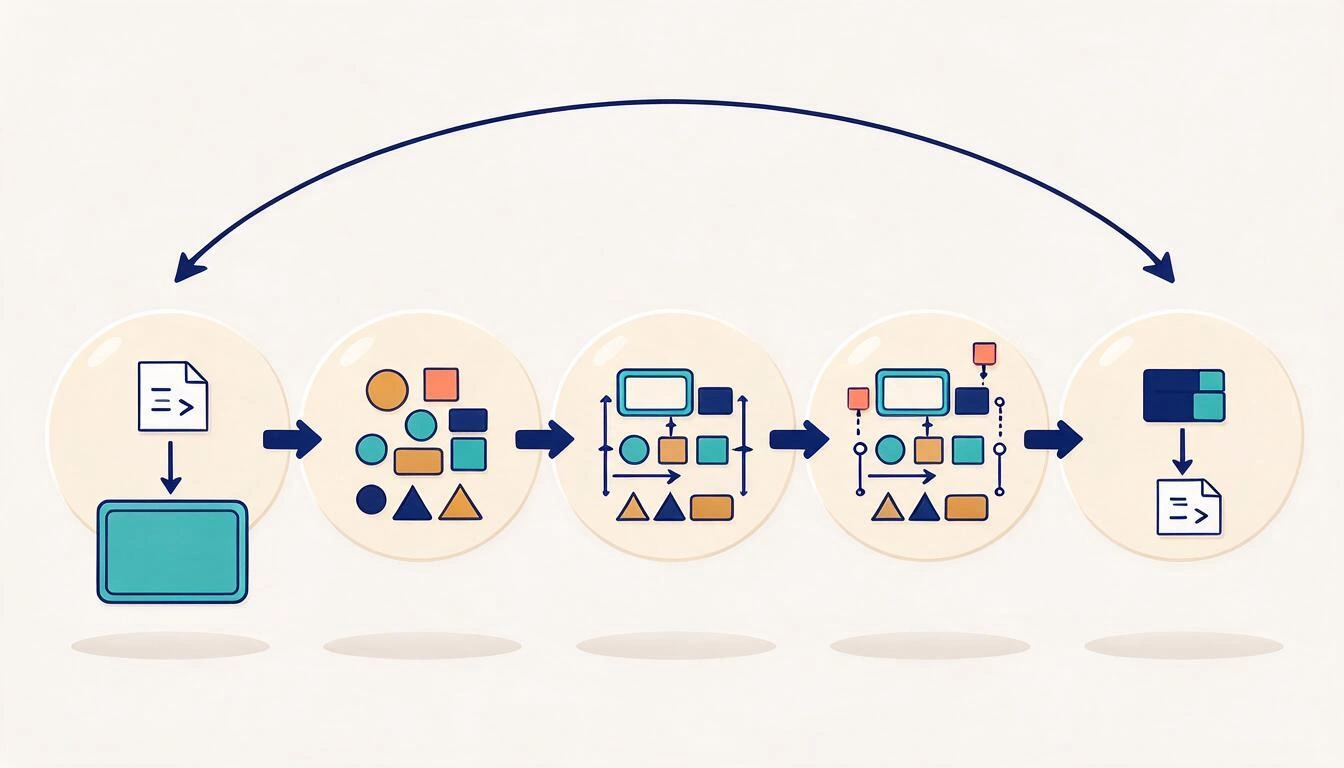
- Import. Paste the
.mmdthat the agent gave you into a visual canvas, or upload it as a file. Objective: separate the review from the code editor, where the temptation is to read instead of look. - Distribute and reorder. Place the nodes in horizontal layers by responsibility (input, orchestration, domain, storage). Almost all defects of direction and false depth are revealed here: an arrow that goes up two layers is often an inverted arrow.
- Mark the doubtful. Each node or connector that you cannot confirm by reading the code is annotated, and the annotation carries a link to the proof: the file, the ticket, the ADR. An audited diagram is not one without doubts, it is one where the doubts are labeled and traced.
- Correct by hand. Unify duplicate nodes, break the generic box into the real stores, add the "no" branch, close with a terminator, change the shape type so that a diamond is a diamond and a store is a cylinder, and re-anchor the connectors to the correct points.
- Export back. Dump the result to
.mmdand replace the original file in the repository, in the same commit as the review. That is the step that most teams skip and the one that prevents the error from being reintroduced.
In practice, step 3 is what turns this into an engineering process and not a layout session. A side note with a link to the specific file that shows that the worker consumes from the queue is verifiable documentation; "I think this arrow is reversed" in a Slack thread, is not.
Checklist: 10 checks before merging an AI-generated diagram
Closed list, designed to be pasted into the pull request template. If any fail, the diagram does not enter.
- Uniqueness: no real component appears as two nodes. One ID per service, the name of the repository or deployment.
- Complete decisions: every diamond has at least two labeled outgoing edges, and the error branch has a destination.
- Terminators: every path ends in an explicit terminal node; there are no chains that cut off in a process step.
- Data direction: each arrow goes in the direction that the information travels, not in the direction of the organizational hierarchy. Especially check queues, webhooks, and polling.
- Disaggregated stores: no generic box like "Database", "Services" or "Infrastructure". One node per store with technology and content.
- Real layers: each
subgraphcorresponds to a boundary that exists (a deployment, a repository, an account, a network), not to a manual abstraction. - Domain vocabulary: labels use the names that the team writes in the code and in the tickets, not the words from your prompt.
- No orphans or avoidable crossings: no disconnected nodes, and any crossings that remain are justified and cannot be fixed by reordering.
- Readable at the size it is published: it is understandable at the width of the
READMEor the documentation portal, not just with zoom. - Traceability: every non-obvious element has a note with a link to the code, the ticket, or the ADR that supports it; and the
.mmdin the repository is the one exported after the correction.
Spec-driven development: if the diagram is wrong, the code inherits the error
This is the reason why auditing stopped being cosmetic in 2026. In specification-driven development, the specification in Markdown —with its Mermaid architecture and sequence diagrams— is the artifact from which the agent generates the implementation, not a comment on it. An incorrect diagram within that specification is no longer outdated documentation: it is a defective entry in a code generator.
The approach is captured in the Spec Kit from GitHub, whose thesis is that "specifications do not serve the code; the code serves the specifications", and the implementation plans it produces include architecture and sequence diagrams in Mermaid along with the data model and failure modes.
Translated to day-to-day: a diamond without a "no" branch in the specification is, quite likely, an unimplemented error case in the generated code. An inverted arrow between API and queue is a push design where you wanted pull. And a box "Database" that covered Postgres, Redis, and S3 becomes a single repository with three responsibilities. The diagram went from being a photo of the system to being part of the blueprint, and blueprints are reviewed.
Frequently Asked Questions
What does "Mermaid slop" mean?
It is an AI-generated diagram with valid Mermaid syntax but lacking communicative value: generic and identical shapes, default palette, poorly labeled arrows, and, in the worst cases, components or relationships that do not exist in the system. The term gained popularity from the Diagram Design project and is documented in the explainX review from August 2026.
Can an AI-generated Mermaid diagram be automatically validated?
Only in part. A linter or the parser itself detects syntax errors, and structural checks can be automated: orphan nodes, diamonds with a single output, paths without terminators, or IDs with suspiciously similar labels. What no tool can verify on its own is whether the diagram accurately describes your system; that requires cross-referencing it with the code, which is why the checklist in this article mixes automatable checks with human review.
Why is it not enough to review the mermaid block in the pull request?
Because in the diff you read edges one by one, and the relevant defects are of the complete graph: crossings, inverted hierarchies, cycles, isolated nodes, unreadable density. Additionally, when reading the text, you evaluate the author's intent and not what the reader will see in the render. Useful review is done on the drawn diagram.
What tool do I use to manually correct a Mermaid diagram?
You need a canvas that completes the entire journey: import the .mmd, allow yourself to move and change shapes and connectors, annotate elements, and export back to Mermaid. That last step is what most viewers discard, which render but do not return the corrected code. FlowBoard covers the cycle: it imports Mermaid from a file or by pasting the code, distributes the diagram on an infinite canvas with zoom and scrolling, allows you to manually correct shapes, connectors, and anchors with magnetism to the anchor points, add side notes with links per element, and export back to Mermaid.
How long does it take to audit an AI-generated diagram?
It depends on the size, but the order of magnitude for a diagram of 15-25 nodes is 20 to 40 minutes the first time, and much less when the team has already internalized the checklist and fixed the domain names. Compared to the cost of having an incorrect architecture enter the official documentation —or, in a specification-driven flow, into the generated code—, it is cheap.
Should we stop using AI to create diagrams?
No. Generating the first draft with an agent saves the tedious work of typing nodes and edges, and it is useful for exploring an unfamiliar system. What should not be skipped is the next step: no AI-generated diagram is published without going through the canvas and the checklist. The AI makes the draft; the responsibility for the diagram remains with the team that signs it.
Conclusion: the diagram you publish is the one you have audited
The change in 2026 is not that AI draws diagrams, but that it draws them faster than we review them. While VS Code paints them without configuration, Claude turns them into boards, and specifications in Markdown feed code generators, the only quality control left is human: looking at the shape, marking what cannot be demonstrated, and returning the corrected version to the repository. Ten checks and a closing cycle are enough for a diagram to become reliable documentation instead of plausible decoration.
That cycle needs a place to happen. At AIsToHire, we solve it with FlowBoard, our infinite whiteboard for diagrams: you paste or import the agent's .mmd, distribute it on an infinite canvas, rearrange shapes —rectangles, ellipses, decision diamonds, documents, sticky notes, and text— and connectors with straight or orthogonal arrows, anchor each connection with magnetism to the element points, annotate the doubtful with side notes and verification links, and export back to Mermaid. The board saves itself, so the audit is recorded and can be resumed.
Open FlowBoard, paste the .mmd provided by the agent, and audit the diagram where it truly matters: reorder by layers, manually correct shapes and connectors, annotate the uncertain with verification links, and export it back to Mermaid. Start your first board for free.
Open FlowBoard, paste the .mmd provided by the agent, and audit the diagram where it truly matters: reorder by layers, manually correct shapes and connectors, annotate the uncertain with verification links, and export it back to Mermaid. Start your first board for free.Keep reading
View all articles →
Flowchart Symbols: What Each One Means and How to Draw Yours Step by Step

Why Your Car Insurance Increased in 2026: Average Premium of €1,412 and Historic Record

Discussing via WhatsApp or talking in person: what science says about couple conflicts through messages